


Microsoft, and perhaps all personal computing, peaked with the release of Windows 7. For most users, machines have not meaningfully improved their real-world performance since then, and the entire experience has significantly degraded. You might need the latest machine to run Windows 11, but you don’t need Windows 11 to run a spreadsheet program. Even a “large” program like Adobe Photoshop doesn’t provide much in the way of meaningful improvement to justify the cost of new hardware. All the speed of the new hardware gets eaten up by poor optimization, or it at least seems to be that way. I can eat up 30 gigs of ram on Chrome tabs, somehow. Windows 7 was, by comparison, svelte.
The real strength of the OS was as much about the visual experience as the many small functional elements that got perverted by later versions of Windows.
Windows Aero, the transparency theme and design language of Windows 7 (and Vista, but we don’t talk about Vista) was beautiful. Installing the OS was the first time since seeing the Mac OS in color (a long time ago) that I thought a computer operating system could be beautiful. After a little customization, it became a visual experience I really looked forward to at the end of the day, and not just because it was a portal to things I wanted to do on my PC, like play games and make music. The visual theme was not merely a great aesthetic experience; it was functional. If you are like me and like to have lots of windows open and placed around the screen in different areas (a mandatory approach on a 4k monitor, by the way), the transparent windows allowed you to better see what was tiled on top of what. The buttons, with their shaded 3D look, were easy and intuitive to understand, especially compared to the flat design language (officially called “Metro”) that was ushered in with Windows 8.
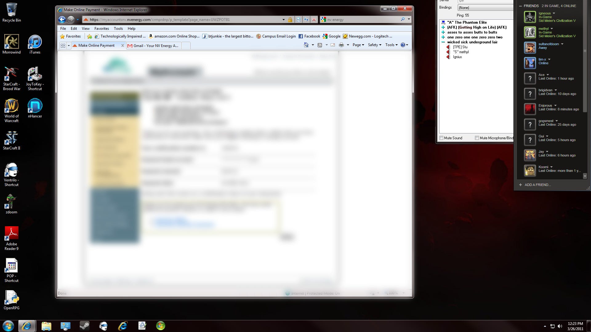
If you don’t know much about “Flat design language,” it is the mode of design that has been dominate for about 15 years now in the digital space, so that user interface elements like buttons are drawn with flat colors. I believe it’s been studied and found to be much more confusing and prone to cause user errors compared to buttons intended to mimic physical (three-dimensional) design. Which button have you highlighted? Is it the white one, or the grey one? Meanwhile, a popout button looks like it is pressed in when you click it. Amazing and beautiful. Apple knew this well, and, unfortunately, abandoned it, too.

Windows 7 was also the last time the start menu was functional. It’s incredible that this core feature of Windows has been so gutted and perverted over the past nearly 15 years. First, there was the travesty of Windows 8, which removed it entirely in favor of a bunch of phone-like tiles, then 8.1, which added it back, but clicking it just brought up the tiles again. For Windows 8 to be functional, you had to use something like Classic Shell, which brought back the simple, intuitive, functional start menu of Windows 7. Once I installed that (I had to use Windows 8, by the way, because Windows 7 couldn’t address all my RAM at the time), I never even thought about the tiles again. I even got rid of them on my touchscreen laptop.
Windows 10 and 11’s start menus felt better because Windows 8 was so bad, but their menus are awful compared to Windows 7, which used text lists to quickly move through large numbers of items. Scrolling through icons (the 11 default) is painful by comparison. Plus, Microsoft put ads in the start menu! The search function once again no longer works, and you must, like in the 1990s, have a very good working file organization system for yourself. There are also dozens of small inconveniences in the modern versions of Windows, like what folders get defaulted to quick access, things like making you click through extra menus to save to a Google Drive folder, etc. It’s all just so full of friction compared to Windows 7. I liked opening up a file explorer window (almost wrote “finder window” which should tell you something about what OS I liked in the 1990s) and seeing all my hard drives, not a bunch of default folders that I won’t ever use, and some recent documents. I like to be in control of my files, of my computer… of my experience.
All of this is not to say there have been no improvements of any kind to the Windows user experience. I like HDR, but I can’t help but feel how much better HDR would be in Windows 7. The last 15 years of design implementation proves the aphorism, “Change is mandatory in product iteration.” This year’s cars have to look different. So does the OS. It has to offer something “new” even if it is a worse experience in every qualitative way.
Just the other day, I saw a preview of the new Apple OS (for iOS, but the gap between mobile and desktop OS is closing), and it featured transparency. My thought was that we already had that, and it was too beautiful, too stylish, too not flat, so designers had to kill it. Apple will get credit again for making a “beautiful” OS. Oh well.
I am an independent artist and musician. You can get my books by joining my Patreon, and you can listen to my current music on YouTube or buy my albums at BandCamp.


The OS/2 desktop from last millennia had capabilities that Windows still does not...
Reading this from Windows 7!